Samaritan Ministries facilitates the sharing of more than $30 million in medical expenses per month among its members. The system works through direct member-to-member sharing, which means clear, accurate communication isn't just a nice-to-have, it's fundamental. When communications break down, the entire model experiences strain under the weight of confusion.
The online bill submission UI had launched in 2015 and had never been significantly updated by 2020. Five years of accumulated friction had created a multi-pronged problem: bill validators couldn't do their jobs effectively, members were receiving alarming and often inaccurate communications about their bills, and call center staff were buried in contacts that shouldn't have needed to happen.
The Problem
A quagmire of tech debt
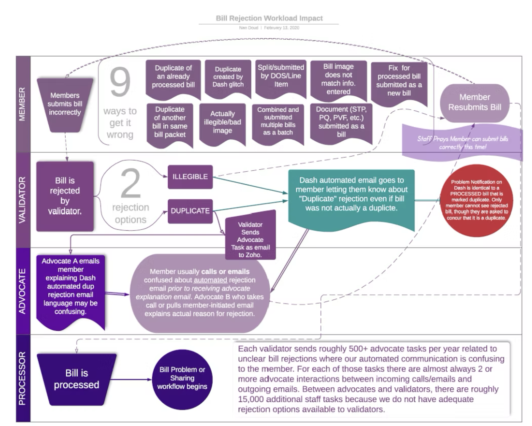
The issues were interconnected and self-reinforcing. Validators had no way to select accurate rejection reasons, which meant the automated communications members received were always vague and often alarming. Members would receive "Problem Alerts" for issues that weren't actually problems, causing them unnecessary anxiety and a flood of confused calls, emails, and chats to the support team. Meanwhile, staff were maintaining complicated, redundant workarounds that severely undercut efficiency.
What looked like a communication problem was simultaneously a tooling problem, a process problem, and a content strategy problem.
My Approach
Starting where the pain was
Working independently at first, I conducted informal one-on-one conversations with internal users and collected qualitative data from direct member feedback; emails, support ticket notes, and feedback reports. Over time I studied the volume of automated and call center emails being sent daily, weekly, and monthly to understand the scale of the problem.
As a subject matter expert due to my frontline experience in member services, I understood the issue on both micro and macro levels. I used Lucidchart to map the pain points and inefficiencies visually, which became a key tool for communicating the scope of the problem to leadership.
Bill rejection workflow — before redesign
Once the project was formally initiated, I collaborated cross-functionally with business leaders, PMs, engineers, designers, and BI through requirements gathering, implementation, QA testing, and troubleshooting. I also partnered with Call Center and Training leadership to facilitate related process changes.
What I Found
A content problem hiding inside a tooling problem
The most significant insight was understanding how our framing affected users. Members were receiving "Problem Alerts" for bill submissions that had been rejected, but bill rejection wasn't necessarily indicative of an actual problem with the user's bill. More often than not, it was a process error. Worse still, members even received these notifications when our internal system glitched, somthing the user should never have needed to see. The alarming language in the one-size-fits-all dashboard and email notifications was creating anxiety and driving unnecessary contact volume. Understanding the user journey, including an empathetic eye toward their fears of extremely large medical bills not being shared was key to seeing the whole picture. Sheer panic drove a large number of the contacts the call center received.
My argument for reframing rejections as "submission errors" accomplished two things: it reduced member anxiety by giving them language that accurately described the issue, and it created a framework for quantifying rejection reasons, which laid the foundation for future improvements the team hadn't previously been able to make.
The 23-month timeline reflected real constraints: nonprofit resource limitations, a global pandemic that reshuffled healthcare priorities, and business requirements that expanded in scope as the team dug deeper into the interconnected nature of the problems.
What Changed
From alarming to actionable
Validators gained the ability to select accurate rejection reasons for the first time. Member-facing communications were rewritten to provide clear explanations, the specific details members needed to understand their situation, and improved calls to action — replacing the vague, frequently incorrect messages that had caused so much unnecessary alarm.
Where the full solution wasn't yet possible, interim process changes were implemented to provide immediate improvement while the cross-functional team worked toward the complete solution. It wasn't ideal, but it did allow the messaging to be tested with members in direct communications before being hard-coded so even those intermediate steps helped with validation.
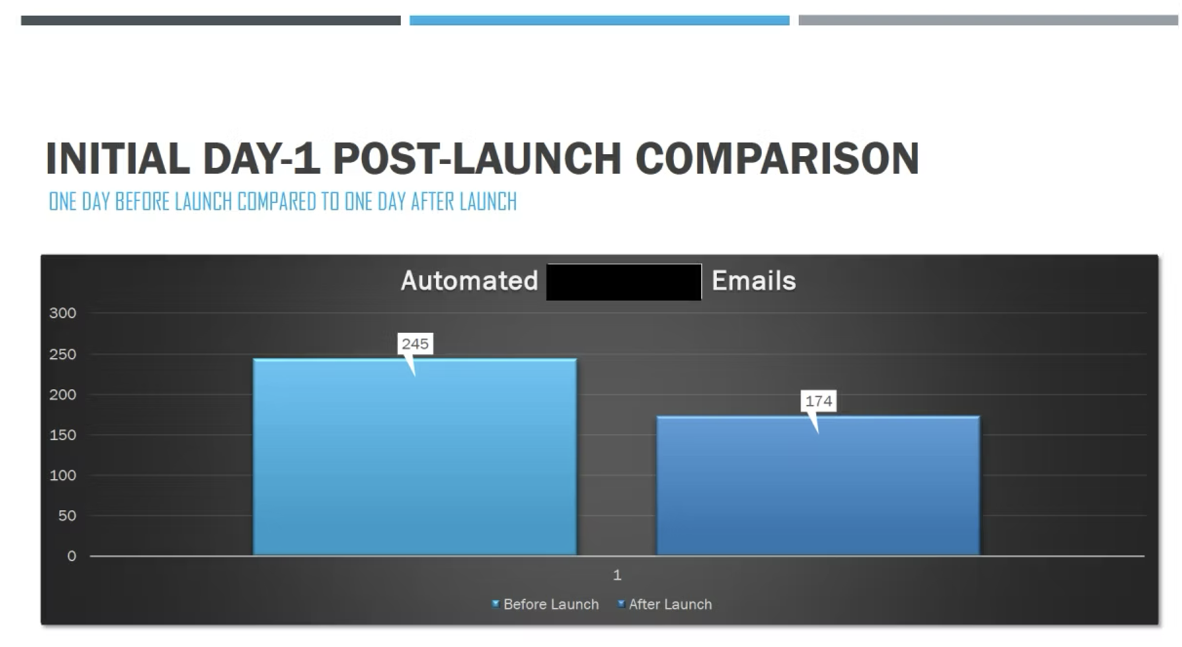
Day 1 post-launch: automated problem emails before vs. after
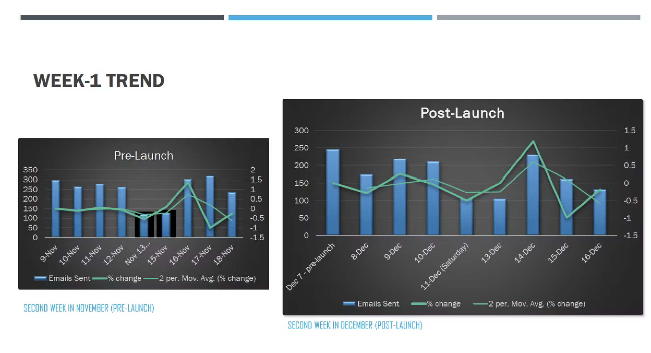
Week 1 trend: pre-launch vs. post-launch email volume
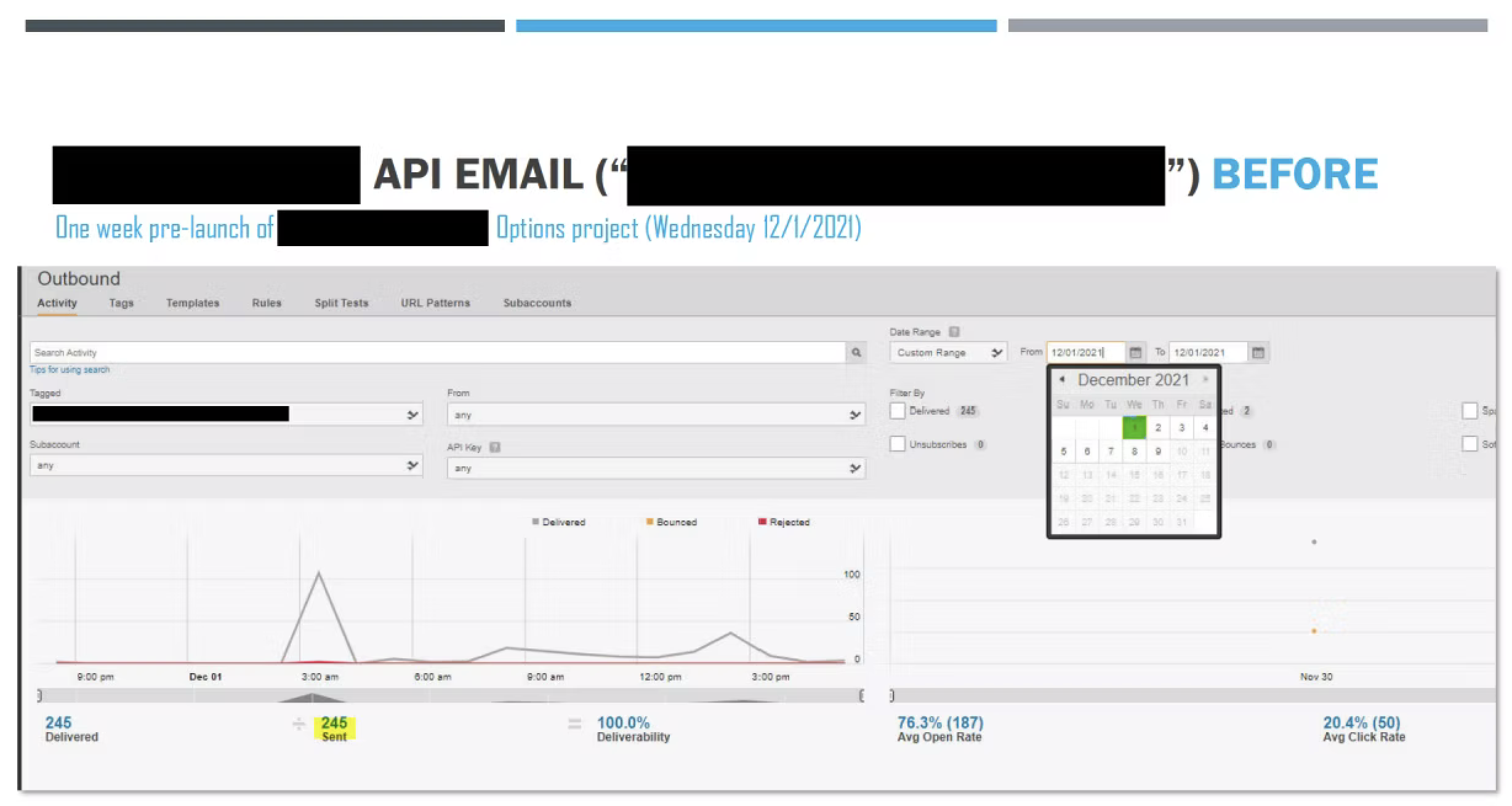
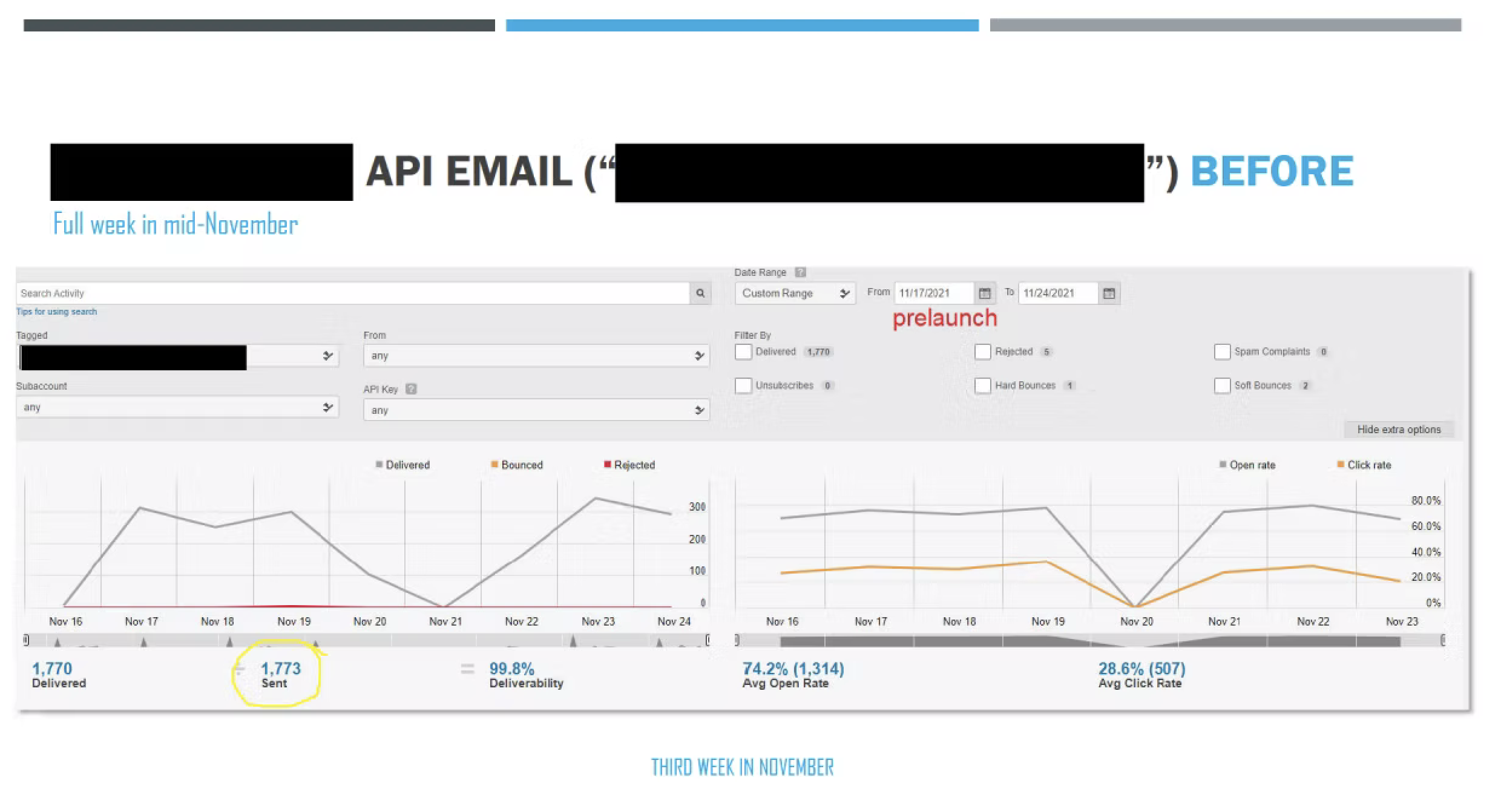
API email activity — week before launch
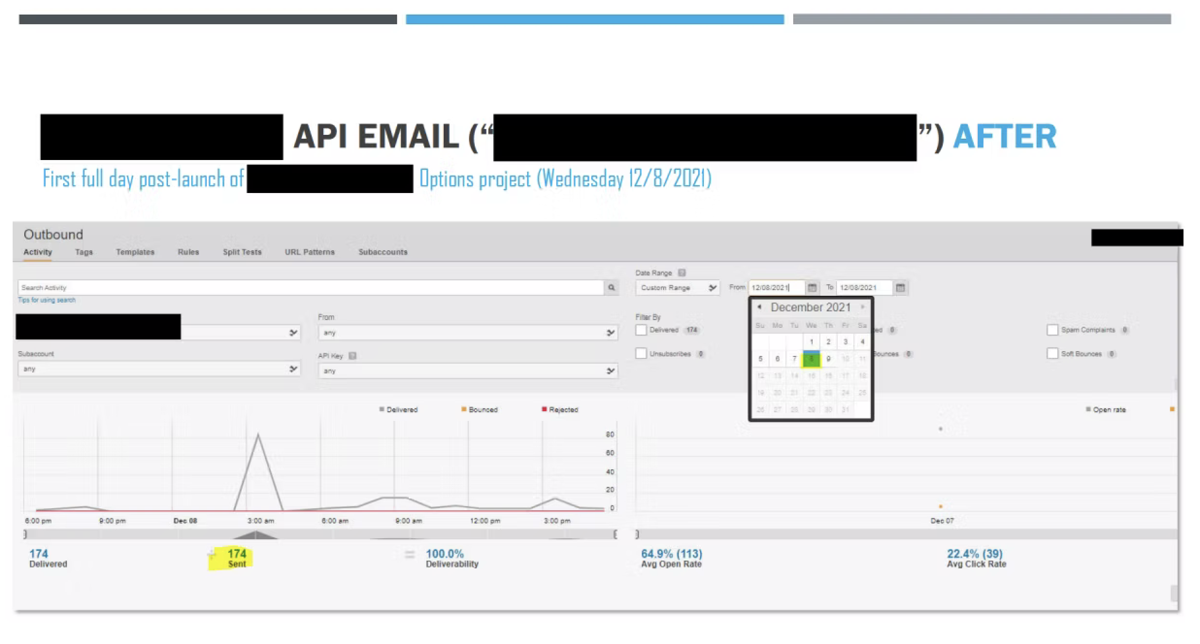
API email activity — first full day after launch (Dec 8)
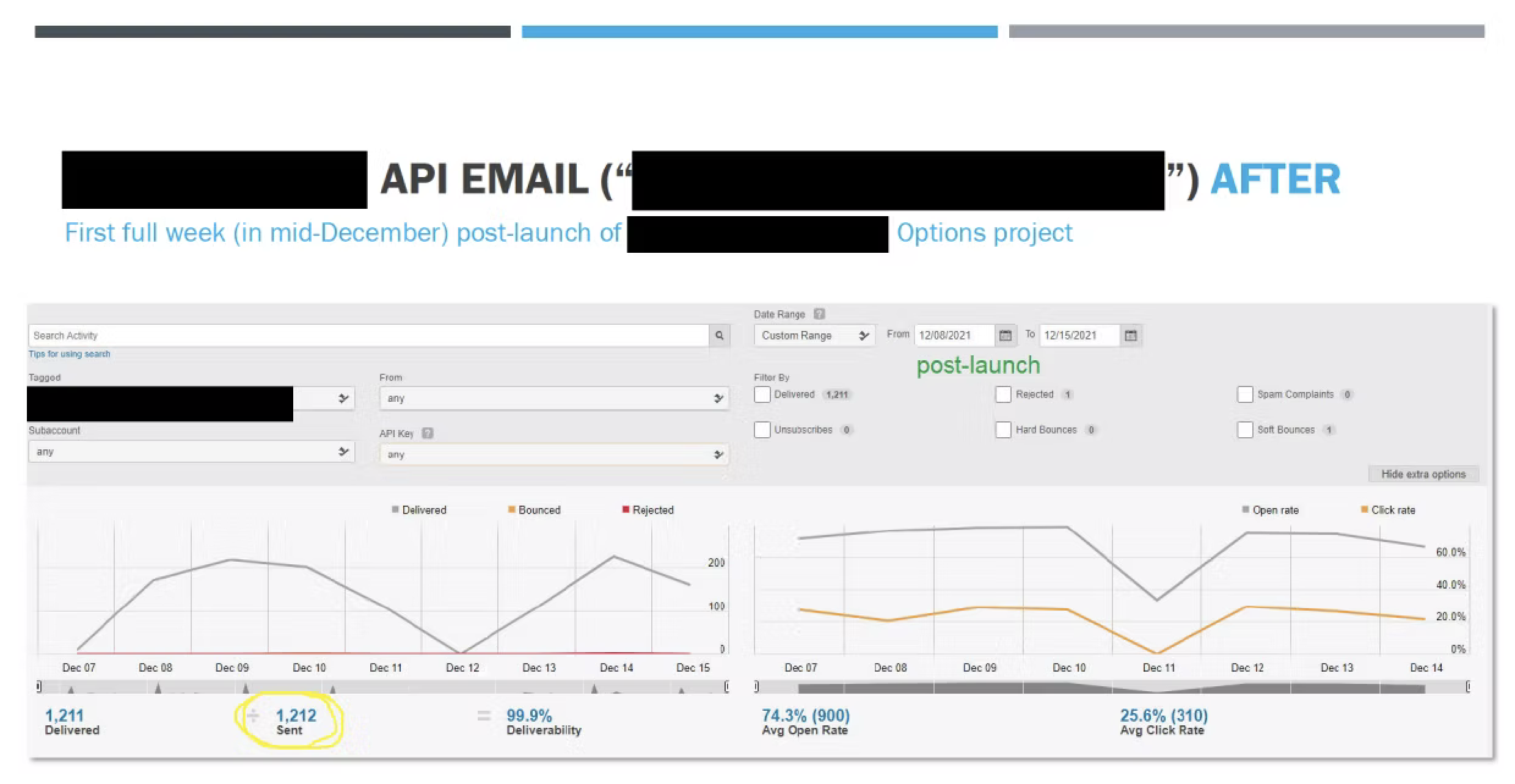
API email activity — first full week post-launch (Dec 8–15)
Weekly volume — third week in November, pre-launch
The Outcome
Tens of thousands fewer confused contacts per month
Following launch, problem-related emails dropped 44% within the first month — a meaningful reduction given that Samaritan was processing tens of thousands of member communications at that volume monthly.
Getting there wasn't straightforward. The project spanned nearly two years, delayed by COVID and competing organizational priorities that were real constraints, not excuses. The work required sustained advocacy — building the business case, maintaining momentum through interruptions, and seeing it through to completion despite the starts and stops and the technical challenges with manual QA testing. The immediate and significant improvement made all the persistence and drive toward the finish line extremely gratifying.
44%
Fewer problem notification emails sent within one month of launch
245→174
Problem notification emails sent one day before vs. one day after launch
~74%
Open rate held steady — emails still being sent were genuinely useful
Outcome
A measurable shift
Problem notification emails dropped by nearly a third within the first week of launch, with daily volume falling from 245 to 174 on day one alone, reaching a 44% reduction over the following month. Open rates held steady at ~74%, meaning the emails still being sent were genuinely useful, not just fewer in number. Each problem email had previously triggered multiple follow-up contacts between members and staff — so the actual reduction in confusion-driven workload was substantially larger than the volume numbers alone suggest.
Tens of thousands fewer confused contacts per month
Measured by call center inquiry type tracking before and after launch
What colleagues said
In their own words
"
Very special shoutout to @Nancy Doud. Your drive and leadership were crucial to this project and without your extensive knowledge and attention to detail, this project may not have been possible.
Ashley Griffith
Product Manager · Samaritan Ministries
"
Now that it is on the validators and the options have changed, no one spends much time at all. Only when the member does not actually read the [automated] email and instructions.
Anita
Call Center Team Lead · Samaritan Ministries
"
Wow! Thank you, Nan, for working on this presentation where you show the comparative analysis of the reduction in automated emails sent to members and the percentage difference in a month after we deployed the code. I am so glad to see this trend. I will add this to our win report for our next MS meeting to showcase the project team's accomplishments.
Sanjay
VP of Member Services · Samaritan Ministries
"
We've been waiting 7.5 years for this.
Bill Validator
Community volunteer · Samaritan Ministries network